Showing posts with label Advanced Digital Design. Show all posts

Sunday, 8 March 2015

The Big Book of Calm


Baffled becomes The Big Book of Calm

Part V of the Advanced Digital Design individual coursework.  Read Parts I to IV here.

Often in meditative practices, we are asked to think of a happy place.  I wanted to have the internal form of my product to echo this sentiment, but without defining it to one particular place - I wanted everyone to be able to imagine themselves within the form.  This was how I began looking at clouds.


In meditation, we are also required to ground ourselves.  This can mean sitting on the floor, or having your feet placed firmly on the floor if you are sitting on a chair.  It symbolises our connection with the earth, and provides a tactile support so you remain focused.


Knowing that I was going to shape the inside form of the book to echo clouds, I also wanted to tie in the grounding factor.  I was inspired by the rugged shapes of the large stones at neolithic stone circles, such as Avebury, Castlerigg and (of course) Stone Henge, so decided to include these in my design.

Working sketches

Once I'd decided on using a traditional book form, the majority of my sketch work had been done in Solidworks, as it allowed me to quickly visualise what my design would look like.

Solidworks Sketch for Left Acoustic Panel


As my design began to take shape, I realised that I had not given the product a proper name.  I felt that the nickname Baffled was more about my feelings towards the project in its early stages, but what I was now designing was far more about wellbeing, and combating anxiety and so the product became known as The Big Book of Calm*. 

* Some of you may also pick up on the Black Books reference, where a very stressed businessman (Manny) accidentally swallows the Little Book of Calm and turns into a chilled hippy!

One of the specific points in our open-ended design brief was that the product had to have some sort of technology in it.  Though the acoustic felt was technologically advanced, it wasn't in itself, technological.  It had been suggested that I might like to put a set of speakers into the product to produce white noise - a tone that "cancels out" other noises (like you get in noise cancelling headphones).  Though there is nothing wrong with that idea, I didn't like the idea of an acoustic baffle actually putting out more noise into the environment. 

What I eventually decided on was a colour changing screen, down the centre of the spine of the book, that lead a breathing exercise.  It was inspired by an app I have on my phone which helps you slow down your breathing, calming your heart-rate in anxious moments, by playing an audio prompt accompanied by a clock visual.  The medically recommended breathing rate to reduce anxiety is to breathe in for two seconds, and out for four seconds.  Using this 2-4 breathing pattern, the screen in my book would change colour from blue to yellow - emulating blue sky and the sun behind clouds.

Introducing...
 The Big Book of Calm

Baffled: A Change of Pace & Paper Art

Part IV of the Advanced Digital Design individual coursework.  Read Parts I, II and III here.

So far, the arc of this project has taken me though generic cubicle design through inflatables, pop-ups and origami, but they all avoided the overhanging question; why do we need this product?

Why do we want a portable sound barrier? I originally thought that to shield us from the noise around us was a good enough response.  Looking deeper though, this physical barrier could also temporarily protect us from the world, it could provide a safe haven for us in times of great stress and anxiety.

The project then began to change pace; this was less about a functional object blocking out noise, and was more about the daily stresses of our lives and how we all want to lead less stressful, chaotic lives.  This un-named product, took the shape of a book to bury our heads in as we do with the novels we love, and took a side-step into the world of wellbeing.

Knowing that the product was going to be constrained by the outside appearance of a hard-back book, I began to consider what form the acoustic felt panels could be on the inside and took inspiration from paper art.

Paper Cuts - ufocinque (flickr user): Source


There's No Place Like - Hari & Deepti: Source
Pop-up style shadow box art, like the pieces shown above, reminded me of childhood pop-up books and the addition of back lighting gives the layered 1D paper cuts an ethereal look.


A Piece of Flat Globe Vol. 5 - Noriko Ambe, 2008: Source

Fictional Landscapes - Kyle Kirkpatrick: Source
Many artists use blocks of paper to carve out sculptures.  British artist Kyle Kirkpatrick uses found objects in his work, and creates miniature landscapes out of old books.

Styrofoam Cup Sculpture - Tara Donovan: Source

Towards a Poetic Morphology - Cloud Collective: Source
The two installations shown above focus on cloud formations, but are created with unusual shapes; Tara Donovan's sculpture consists of styrofoam cups, lit from above to give undulating cloud like forms and the Cloud Collective uses varying heights of lettering to give wave-like motion to a poem.

I considered playing with text on the inside of the book, echoing the Cloud Collective piece, using W. H. Davies' poem Leisure, but I couldn't settle on a form that I was happy with.  I also didn't want the insides of the book to be so prescriptive, to allow it to be used to by anyone, so I decided to take my inspiration from the paper cuts of Noriko Ambe and the work of Hari & Deepti, and tried to focus in on the subject of wellbeing.

Baffled: Form Factor

Part III of the Advanced Digital Design individual coursework.  Read Part I and Part II here.

After the feedback I was given during my last presentation, I decided that I needed to explore the narrative of the baffle more, and to start re-working it's form factor.

The two aims of the product are to; a) absorb sound and b) be compact.  Though I'd looked into compressibility in the past and thought inflation might be a novel solution, I knew I had to come up with a compression method that had more to do with the narrative of the product.

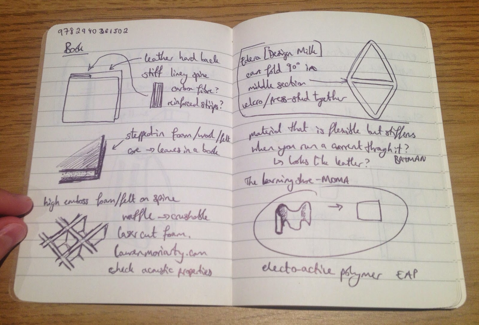
In my mind, the ideal setting of the product would be a noisy area that you want to shield yourself from.  Because of the size, and portable nature of the product, I kept going back to the analogy of a book, and propping up an open book in front of you while you are working; could it have the form of a book?
I started sketching out some ideas based around this, with two flat sides (like a hardback book) and a fully flexible spine.  I thought about crushable patterns, and was inspired by the work of Lauren Moriarty, who uses a lasercutter to etch patterns into foam.
Crushable structures - Lauren Moriarty: Source
Crushable structure - Lauren Moriarty: Plastics Handbook by Christopher Lefteri (Detail)
Left: Sketches, Right: Detail of traditional Japanese kimono

This lead me to look at paper.  Though my product was going to be made of acoustic felt, I started looking at traditional paper folding techniques, origami and pop-up books, to allow the product to be folded down into a much smaller space.

Origami structure - Paul Jackson: Folding techniques for designers by Paul Jackson (detail)
After hours deliberating, I decided that making the product crushable, or compressible, wasn't the direction I would like to take with it - it wasn't intuitive enough to use.  I decided to look back again at the archetypal hard-back book form.

-----------------------------------------------------------
Books I've been reading:
Origami : the art of paper folding -  Robert Harbin
Paper engineering : 3D design techniques for a 2D material - Natalie Avella
Folding techniques for designers : from sheet to form - Paul Jackson
Cut and fold techniques for pop-up designs - Paul Jackson

Sunday, 23 November 2014

Baffled: Design Ideas & Presentation

 
I started the design process by creating a mind map of different ideas and followed that up with some sketches of how the folding would work and how the surround would hold itself upright.


My general thoughts were to get the baffle to fold down to the size of a packet of pocket tissues, so they could be carried in any size handbag or rucksack.  I also explored the idea of a self-inflating baffle with a low density foam core that could be compressed down very small but would inflate discreetly.  A self-inflating model could also then be used as a head rest in a noisy train to lessen the noise around the passenger.

When I presented my sketches last week, I felt that I had looked at this project from all realistic angles and come up with some novel solutions.  I knew that my sketches were a bit lacking - to be honest I've really struggled with the whole magic marker thing.  I've looked at all the recommended books and done some practice but I ended up colouring my sketches in with chalk pastels as I just felt more comfortable with that.  Also, I feel like I've never had to draw something with no real references before.  I've painted oil portraits and acrylic still life and have done a number of water colour botanical illustrations, so it's not like I don't know how to draw organic shapes (actually, my lecturer didn't realise that I've had such a varied arts background, sometimes it gets hidden behind my engineering background), I just prefer geometric precision and line drawing and I think my style is similar to traditional engineering drawings.

Actually, the bulk of the criticism I got was about the form factor of the product.  I've found it hard to get to grips with this as I've never considered products to have to represent something, or inspire the user, as well as just being a product.  I appreciate and understand the feedback that I've gotten, and am going to try to explore different form options, trying to pull inspiration from various places.

I think that's what is going to be the challenging part of this module for me.  Whereas the other students with arts backgrounds are working hard learning engineering and digital design, I am having to really prove that I can marry art and design, and that engineering doesn't define me.  Just because I have a first class honours Masters degree in Engineering (cue the trumpet fanfare), doesn't mean that I'm not just as much an artist and designer as my fellow students, I just need to get back into the swing of it.

Out comes the sketch book...

-----------------------------------------------------------
Books I've been reading:
Learning curves: an inspiring guide to improve your design sketch skills - Klara Sjolen
The language of things - Deyan Sudjic
Materials for inspirational design - Chris Lefteri

Baffled: Preliminary Research

The project I've been developing for my Advanced Digital Design coursework is called Baffled.  It's essentially a portable baffle, for reducing noise in your working environment.

I had the idea whilst working in the library where I sit in a small cubicle.  The cubicle helps reduce the noise a bit (our uni library is surprisingly noisy!) but because it's made of wood, it doesn't absorb any of the noise, it just partially blocks it.  While I was at London Design Week this year, I noticed that there was a very prominent trend of felted woolen upholstery, particularly in office furniture, as well as winged chairs with high backs.  I only realised later on that these were all acoustic baffles.

Joint Design Direction - Source
 There are loads of companies making this type of furniture, but interestingly there are also companies that specialise in custom wall installations and partitions made of specific felt and dense foam to absorb noise.

Wobedo wall hanging - Source

One company I approached, Wobedo, had a small wall hanging which reduced sound pollution dramatically when you stood in front of it.
BuzziSpace desk partition - Source

There are a number of companies producing this acoustic dampening felt (some of which is 100% wool, others are made from recycled PET), but the largest company designing these products is a Swedish company called BuzziSpace.  Though the application of this felt ranges from furniture to lighting, I noticed that none of the manufacturers are using it in a portable product, or certainly not on a scale that you could fit in a rucksack.


-----------------------------------------------------------
Books I've been reading:
Learning curves: an inspiring guide to improve your design sketch skills - Klara Sjolen
The language of things - Deyan Sudjic
Materials for inspirational design - Chris Lefteri
Presentation techniques: a guide to drawing and presenting design ideas - Dick Powell
Drawing for designers - Alan Pipes
Collapsibles: a design album of space-saving objects - Per Mollerup

Saturday, 22 November 2014

Overview of Processes

Things I have learnt this month:
1) A month goes really fast
2) Thinking is hard
3) Thinking is best done in a specific environment (it turns out that I don't think well at home!)

Apologies to my coursemates who have had to hear me verbalise my various internal conflicts over and over again.  For those of you who missed it, here is my visual summary...

Design Agendas

My Design Agendas work started off by looking at Ettore Sottsass who, as it turns out, was a very confusing character and quite difficult to define.  He began his career as an architect, studying in Vienna, with a focus on modernism but ended up becoming a figurehead of the anti-design port-modernist movement.  Sottsass himself disliked being pigeonholed into a style (despite being a founding member of Memphis, which seemed to be the pinnacle of post-modern design), and often talked about his fondness for modernism and how post-modernism wasn't always a send-up of the turn-of-the-century utilitarian design, but how it was more of a reaction to the rules set out by governmental design boards on "good design".

Ok, so I still don't like the work he produced, but at least now I can appreciate where he was coming from.  His sentiments also echo my own; though I love the sleek, functional aesthetic of modernism, I think it would feel oppressive to live with only those objects, their bleak and spare designs devoid of joy and personality.  The designs produced after the post-modernism movement gave us a much more playful aesthetic, allowing designers to be flippant and have fun with their designs without them having to have some deep and meaningful core message.  Yes, this gave us the mass-produced plastic dross that we throw away by the tonne but it also gives us pieces to enjoy just because we like them - Alessi's plastic range - without anyone trying to tell us that it isn't "good design".

So then I spent a lot of time thinking about the celerity culture around design.  Being a sentimental type, I think back on William Morris's ethos that everyone should be able to afford stylish items (of course in practice, his hand-crafted items ended up being well out of the reach of the layman).  My mind then goes to the "big name" designers; Ron Arad, Zaha Hadid, Jonathan Ives, Philippe Stark etc. I have to say that regardless of whether I like specific designs or not, the overwhelming factor for me is the vulgarity of the celebrity designer.  That's not to say that I'm pro anonimity in design, but it bothers me that many people think that these designers have the Midas touch.  Out of this internal rant, I came to the conclusion that one of my design agendas should be to keep my designs humble.

Advanced Digital Design

At the same time as all this internal dialogue is going on, I had to think of a product to design and prototype for my digital design module... Not surprisingly, this took a very long time to do.  Looking back on it,I can see a direct path between my thoughts but when you're in the midst of it, it's a lot less clear.

It started on an internal debate about whether I could create a deliberately obnoxious design - I was thinking of a speaker that would shout out tweets or facebook status' out loud to make people realise the things they say on the internet.  Oh and it should have the voice of John Cooper Clarke.  Quickly my brilliant idea became less brilliant as I realised that I don't have it in me to produce a design for something so obtuse and keep it going for a few months until the delivery date.   I just couldn't get fired up by anything.

During this time, we also had to come up with 5 key words that would help us focus our design intentions.  Again, I think this probably says more about my own state-of-mind at the time than anything else and were widely misinterpreted, so were probably too tenuous.  My words were: Gender Neutral, Dystopian, Joyful, Reclaimed and Natural.

Progression

About this time in both the projects I really started to have some personal motivational problems, surrounded by the confusion in my own thoughts and the stress from knowing that I had to come up with something.  I consoled myself with the saying "if it was easy, it wouldn't be worth doing".  My own personal crisis led me to look at the topic of wellbeing.  I once heard that 80% of students at university suffer from a mental illness during their university life, so even if I designed something that I could use to reduce my anxieties, maybe it would be useful for others too?

This led me to a quote from Confucius, "Life is simple, but we insist on making it more complicated".

After a rather chaotic meeting where I emptied my mind onto the table in front of my bewildered coursemates, my tutor managed to sift through my knotted thoughts to define what he thought could be my design intentions.  A week of thinking further about them in preparation for a presentation allowed me to solidify my own processes and this is what I have come to...

Simple, passive utility.

-----------------------------------------------------------
Books I've been reading:
Cradle to cradle : remaking the way we make things - William McDonough
Thinking: Objects - Tim Parsons
Ettore Sottsass: architect and designer - Ronald T. Labaco
Just kidding!: A to Z designs for kids & kidults -  Viction
Printing things: visions and essentials for 3D printing - Claire Warnier, Dries Verbruggen