Simple
In physics and maths, the best theories have the simplest equations. Newton's Second Law, F=m.a, which is covered by Einstien's Theory of Special Relativity, E=mc2, define the properties of the universe from planetary motion to micro scale motion, and the reason they are heralded as the most important two equations in maths and physics is because of their simplicity. Infact, Einstein is quoted as saying "everything should be made as simple as possible, but not simpler."My definition of simple isn't bound just to aesthetics (actually, I think that modernism has the potential to have dystopian overtones if you were to surround yourself with it), but with mechanisms and the way we interact with objects - they should be intuitive and not overcomplicated.
It also relates to sustainability. The fewer parts a product has, the easier it can be maintained or dismantled should it be thrown away.
Passive
This goes back to a particular object in my life. My mum has a wooden spoon that I have made her promise never to throw away (ditto a kitchen table). Though completely unremarkable in appearance - it's literally a basic wooden spoon - in it's own way it represents my childhood memories. The fact that it is made of wood also has resonance with me, as I think wood is one of the best materials for absorbing history; it scratches, scuffs and stains easily, telling tales of it's life much like the scars and marks on our own skin.In my mind, passivity of a design allows a user to have a real relationship with that design through their interaction with it and allows them to project their own meaning on it. I'm not interested in creating superficial relationships with objects, cherished just because they were designed by a celebrity designer and can be used for confirming social status. My aim is to produce humble designs that people can connect with in their own way and don't add to the noise of our everyday lives.
Utility
Being a mechanical engineer, I have a real love for products that do something mechanical. I'm not fond of dummy objects whose only value comes through their wifi connectivity (Nike's FitBit for example). I prefer objects that can be used as tools that a person has to interact with on a physical, tactile level.Utility for me means that a product should have a job to do, and it should do it well and be uncomplicated to use. This also relates to my simple agenda, but also on inclusive design as I believe that all people should be able to use the same products.
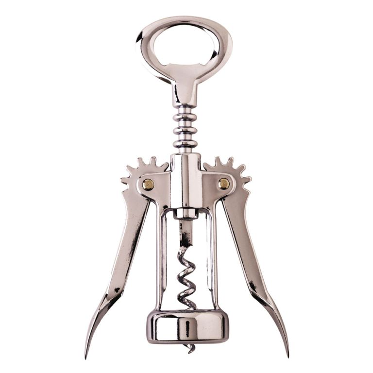
A design that echos my personal design agenda would be a corkscrew. It's a simple design that does its job well and doesn't require extra styling (though I know Alessi have managed to produce a stylised one). It is an object that you wouldn't ordinarily have a connection with on a personal level and is produced cheaply but it avoids throwaway culture. You wouldn't throw it away unless it was broken, you don't feel the desire to buy them in lots of different colours and not many differ from the core designs. It's a simple utility product that has a passive aesthetic.
 |
| Source |
Now if only I can come up with something like that!
-----------------------------------------------------------
Books I've been reading:
Design in context - Penny Sparke
Twentieth Century Design - Jonathan M. Woodham
As long as it's pink - Penny Sparke
